
Where did my money go?
Updated
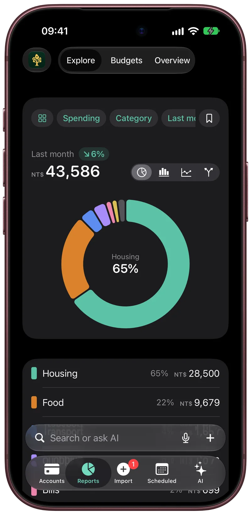
To find out where your money went, take one full month of spending, group it by category, and look inside the two or three largest groups. A few categories usually hold most of the total. In Fullgrove, Reports › Explore draws the month as one chart, and a tap on any part opens the entries inside it.
Start with a whole month
A single day or week misleads, because rent, insurance and card payments fall on different dates. Use last month, which is complete. If your records have gaps, the card statement for that month fills in every card purchase at once.
Group it, then open the largest group
| Category | Last month | Share |
|---|---|---|
| Housing | $1,450 | 46% |
| Food | $690 | 22% |
| Transport | $310 | 10% |
| Subscriptions | $95 | 3% |
| Everything else | $605 | 19% |
| Total | $3,150 | 100% |
Housing is fixed, so the next group to open is Food.
| Inside Food | Last month |
|---|---|
| Restaurants | $380 |
| Delivery apps | $190 |
| Coffee | $72 |
| Other | $48 |
Food was one number. Opened, it shows $190 of delivery, which is a line a person can decide about.
Example figures show the method only.
Compare with the month before
A category that is the same size every month is a fixed cost. A category that grew since the month before is the one to open. Comparing two months also shows a bill that comes once a year, which would otherwise look like overspending.
The same steps in Fullgrove
- Explore is the first page of Reports. Above the chart you choose what to measure (Spending, Income or Left over), what to group by, such as Category, Shop or Account, and the period, from this month to the last 12 months.
- On a first visit, when this month has no entries yet, Explore opens on last month.
- A badge above the total shows the change from the period before.
- Tap a part of the chart, or its row below, to go inside it. A category opens into its shops, and a shop opens its entries.
- The chart can be drawn as parts of the total, bars over time, a running total or a money flow from income to spending.
- A view you use often can be saved.
The Accounts tab gives the short answer
The first tab, Accounts, opens on three lines. Today shows the money you can spend now and about how many months of spending it covers. Coming up shows what is due in the next 30 days and names the next bill. Over time shows your net worth and how much it moved this month, and a tap opens net worth drawn day by day. The full account list is one tap below, under All accounts.
What the chart depends on
The chart shows what is in the ledger. Card spending is complete once the month's statement has been shared, and cash appears when you typed it. Each category is the app's reading and can be changed with a tap, and the change is kept for the same item next time. Entries in a currency with no exchange rate are left out of the total, and the screen says how many.
Find where last month's money went
- Share last month's card statement to Fullgrove so the month is complete.
- Open Reports. Explore is its first page.
- Choose Spending, Category and Last month above the chart.
- Tap the largest part to see its shops, then tap a shop to see its entries.
- Read the badge above the total for the change from the month before.